1/ Open Flash, create some text. It would be better if you choose a font which is bold and thick.
2/ Use the rectangle primitive tool to draw a rectangle around the text. Dont choose stroke color, just choose the fill color. To get rounded corners, set the corner radius to an appropriate value. I used 15 degrees.
3/ With the rectangular object selected (make sure you select all four sides!), go to Modify > Shape > Convert lines to fill. Note the difference when selecting lines vs selecting fills.
Next we need to deal with the text. With the text selected, press Ctrl + B twice, to break the object into fills.
=> You will get the result like this:
4/ Choose the erase tool to erase bits and pieces of our work. Just feel free to do so.
5/ the Ink Bottle tool and start clicking away on the individual pieces you've produced from the erasing.
===> This is the final work. Very simple but impressive huh? ^^
Sunday, January 11, 2009
Saturday, January 3, 2009
mask in flash
There were some people in class ask me how to use mask in flash like i did. Now, i wrote this tutorial, hope it's usefull for some of you guys. It's very simple. Trust me
1. Open flash, set the frame rate about 24.
2. Create 4 layers and name them.
1. Open flash, set the frame rate about 24.
2. Create 4 layers and name them.
3. Choose the Paint Bucket Tool (K) to fill the background. I prefer dark color. Then lock this layer.
4. At the first frame of layer text1, type any text then convert it to movie clip.
5. At the frame 20 of layer text1, press F6.
6. Click on the first frame of layer text1, click on the text which is the movie clip now, decrease the Alpha of this movie clip to about 35%. Then, between frame 1 and frame 20, create motion tween.
7. At the frame 20, click on the text which is the movie clip now, press Ctrl C. Then, lock the layer text1.
8. Move to layer text2, at the first frame, press Ctrl Shift V (to paste exactly the same position as the text at layer text1). At the frame 20 of layer text2, press F5.
9. Lock the layer text2. Move to layer mask. At the first frame of layer mask, use Rectangle tool to draw a rectangle.
10. Convert the rectangle to movie clip.
Move to the frame 20, press F6, place the rectangle as below
11. Between frame 1 and frame 20 of layer mask, create motion tween
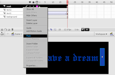
12. Right click on layer mask, choose Mask
Now, see how it looks. Elegant huh? ^^
Saturday, December 13, 2008
Typography
Here is my typography exercise in class. I made in basing on the sentence "Size matters not. Look at me. Judge me by my size do you? And well you should not. For my ally is the Force, and a powerful ally it is." I used mask to make the text looked a little bit scary like the man's voice ^^
Curve
This is my work after I played around with Curve tool in photoshop. In fact, I dont know how to redo this work in the end. It was created throughout lots of steps, but just some tool about light and shadow, such as color balance, hue and transition, level, and the main tool I used was Curve.
This is the orignial one
Sunday, December 7, 2008
my beloved sister
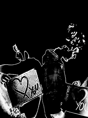
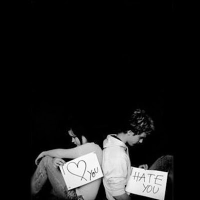
These are my newest works. I did it last night because my sister asked me to design some pictures for her. I was busy with my java assignment so i just spent a plenty of time to make those pictures for my sister.However, she really liked them, she told me that i was so clever. Actually, my works do not look bad, do they? ^^
The difference between an artist and a designer is the artist wants to satisfy himself but the designer has to satisfy his clients. In my situation, my client was satisfied and she had to buy some food for me. :))
Saturday, December 6, 2008
Photomotage
This is my work for assignment about photomotage. I caught the idea from a movie named "The Andromeda Strain". Actually, my work does not have the same meaning as the movie's. I just used the movie 's name, which means an artificial mind in Vietnamese. Therefore, I used some computer chips connect to my mind as the main element of my picture.
Saturday, November 22, 2008
layout
This is the result of my assignment 1. I wrote a short essay about Kazimir Malevich. Then, i created the magazine layout for my document. I'm sure that you are having the idea in mind that my works is very, very simple. However, these background are based on the works of Kazimir Malevich except for the first one.
The first page contains the word " Kazimir Malevich" that i designed after we had the lecturer about Carhartt. I arranged all the basic shapes in an abstract way like the way, just like Kazimir Malevich's style also.
I am wondering what is the standard to evaluate an art or design work. If i draw a black circle surrounded by a white circle like Kazimir Malevich did, definitely, no one wants my picture. However, in Kazimir case, people are auctioning off this kind of work and the price of it is 60 million dollars currently. That's so amazing!!!
Subscribe to:
Posts (Atom)